Sunday Service - Identity
The Problem: Create an identity for the launch of Sunday Service; Preston’s first event night aimed specifically at workers within the bar, restaurant and hospitality industry. A chance for them to relax, unwind and have drinks with people from the same industry. The aim of Sunday Service is not just to sell drinks, but also to create a community spirit within the local industry
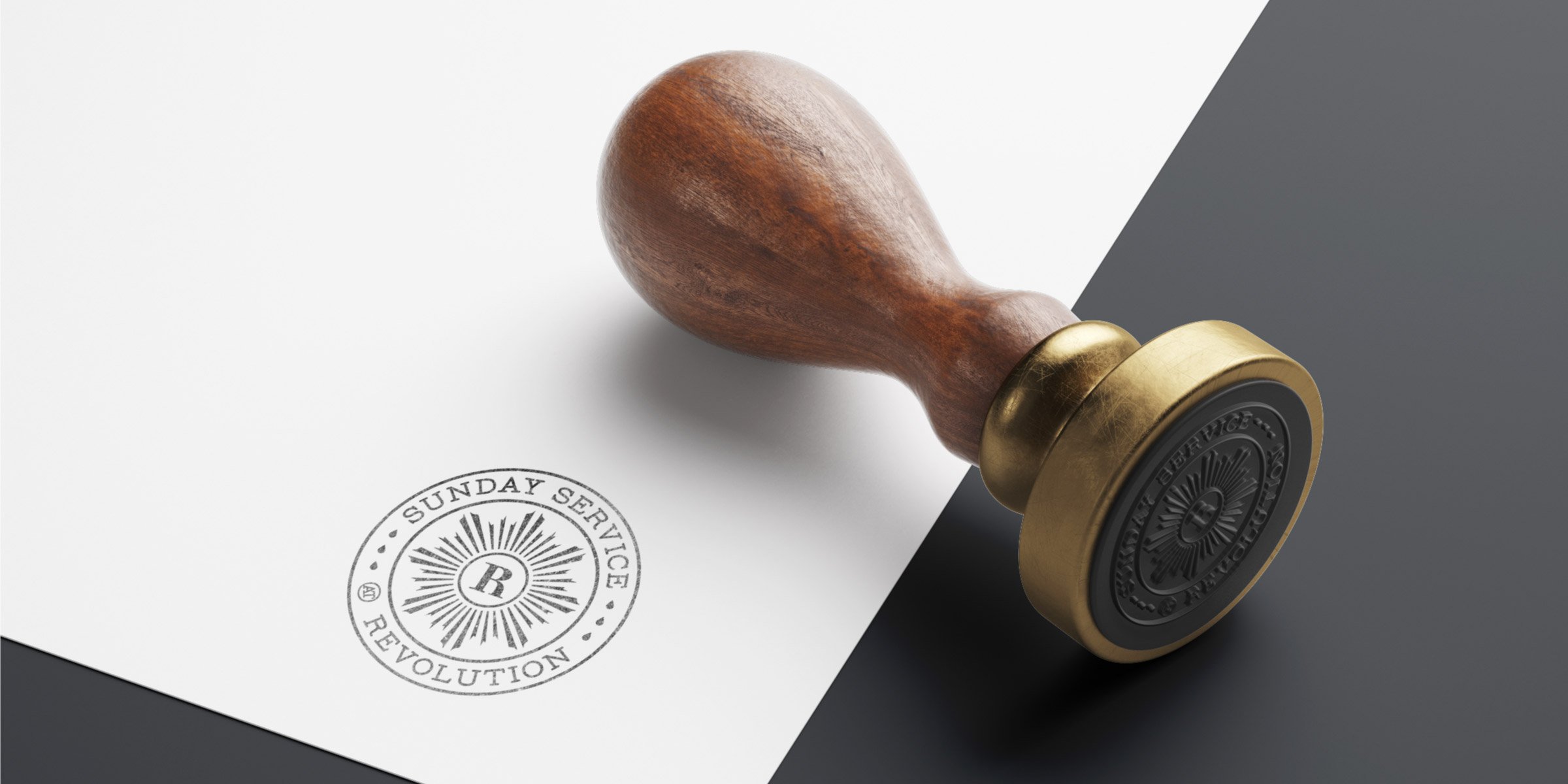
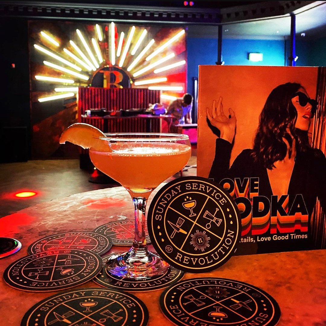
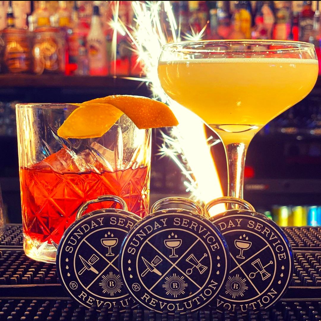
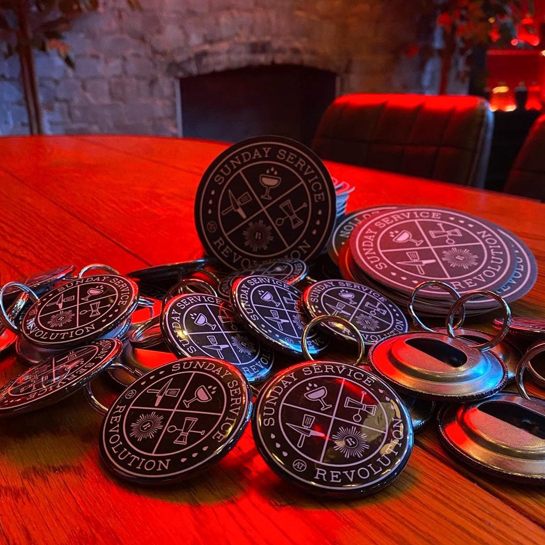
The Solution: For the identity we leaned into the idea of Sunday being a religious day, wanting to conjure up ideas and feelings of something special, sacred and important. An event where everyone is welcome, equal and can share together. Something symbolic that can help you start/end the week surrounded by people who have shared experiences. We combined these feelings with icons depicting the trades of bartending, cooking and waiting-on. Because the home for Sunday Service was to be Preston’s Revolution which is part of a national franchise of bars, there also needed to be acknowledgement of that brand equity
Due to the many moving parts needed for the identity, an emblem or seal felt like the most logical direction to go. It also adds a sense of authority and established sophistication, adding exclusivity to the overall identity. We purposefully gave the overall aesthetic a very dark undertone, aiming to further establish a sense of subtle style and an enigmatic vibe. This is something that runs quite opposing to Revolution’s main branding, but works well for the target audience of the event, and works especially well within the setting of the Preston venue
“Thanks again for all the work done, it’s class. It’s so integral to our image and is basically at the forefront of everything we do. Very proud to flash the logo on as much (stuff) as possible”