
Lethal Minds - Identity, EP, Merch
The Problem: Develop an identity for Lethal Minds; a heavy hitting, socially and politically aware Hardcore band from Preston. Create a visual identity that acknowledges genre aesthetics and influences, but still offers something visually fresh and unique. Above all, the identity must deliver an instant visual explanation of the heaviness and aggression of Lethal Minds’ musical output.
The Solution: I have been lucky on two fronts with the work created for Lethal Minds. Firstly, I have been involved in creating their artwork since their inception, and secondly the band see the visuals and artwork as an integral part of the their creative output. Lethal Minds have ideas of what they want the artwork to look like, but they also have faith in the other people they work with, allowing for creative scope. For the logo, the brief was essentially “just create something as hard and mean looking as possible”
The initial ideas were heavily textured, but ultimately extremely digital looking. While the band liked the ideas and direction the visuals were heading in, we all felt that something was missing. I decided to print and photocopy the band name, and then set to work: tearing, scratching, screwing up, and generally disfiguring the printouts. I then spliced and pasted them back together with a scalpel and tape. From there, I scanned the results in, cleaned them up slightly, eventually splicing bits from each of the experiments together in Photoshop to get the final logo.
This process also gave us other elements for the aesthetic. Texture plays a heavy part in all Lethal Minds artwork, along with high contrast, black and white imagery. For the EP artwork we decided to use a photo of Preston Bus Station, taken by one of the band members at 3am in the depths of Winter. A large, imposing, concrete, brutal sculpture felt like fitting imagery for a first EP of heavy and angry music. This was layered with digital textures, before adding the text elements.
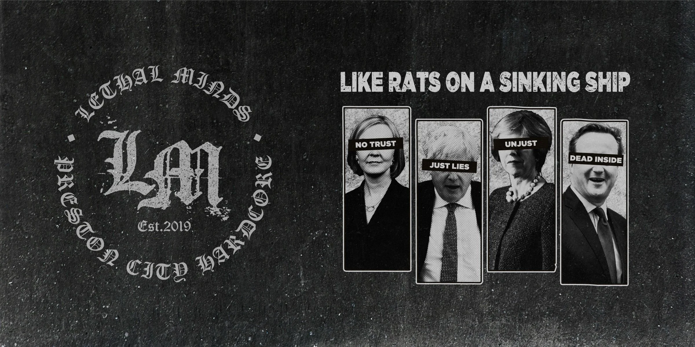
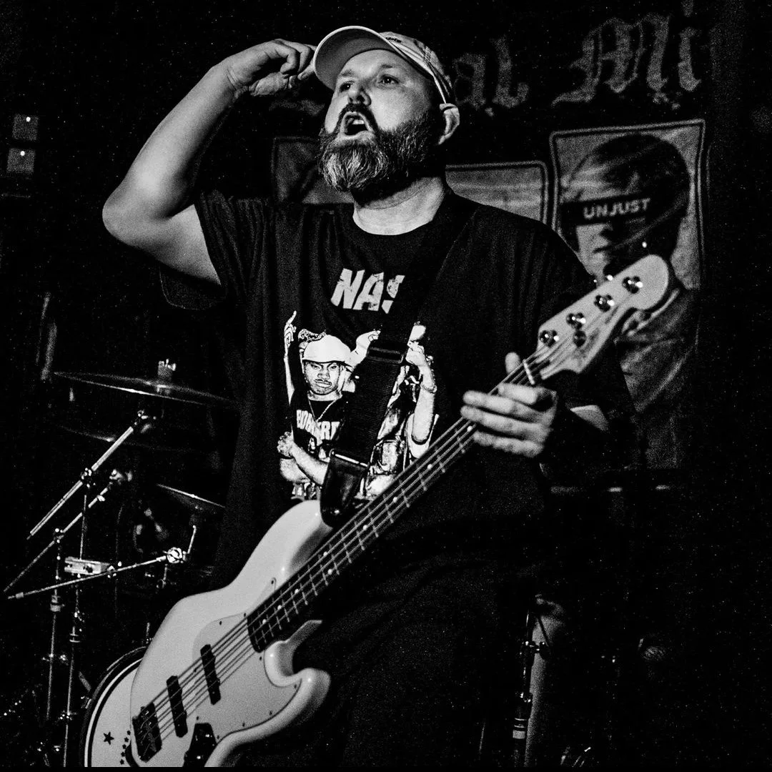
Merch items have also maintained this aesthetic. Textured, spliced together visuals and bold, hard hitting typography to highlight lyrical themes and content. The whole visual language used for Lethal Minds aims to signify channelled and targeted anger with ultimate efficiency.


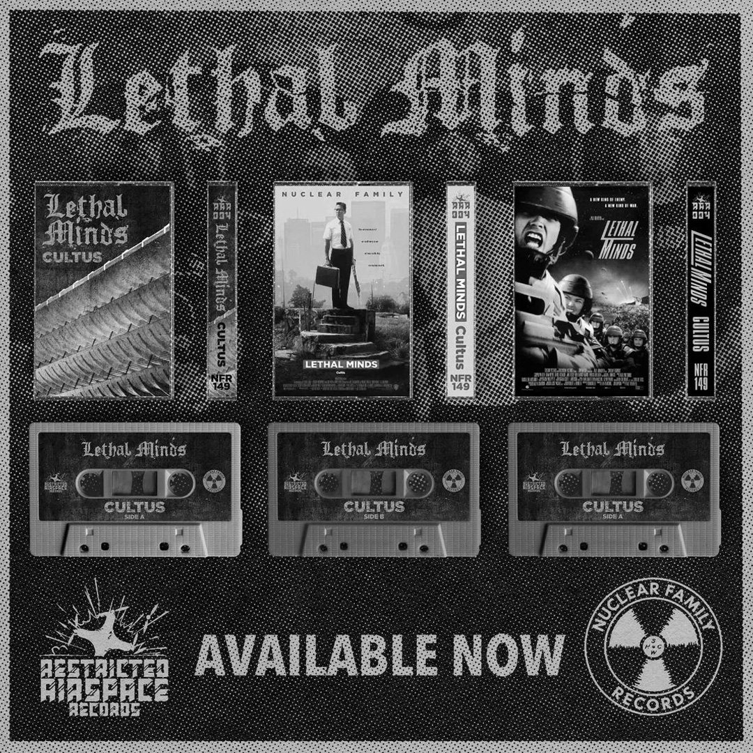
Promo artwork by Nuclear Family Records

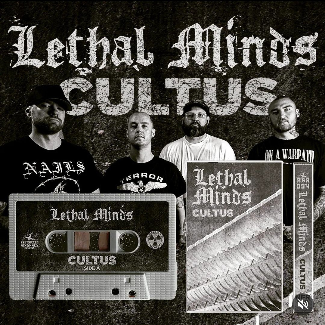
Promo artwork by Nuclear Family Records
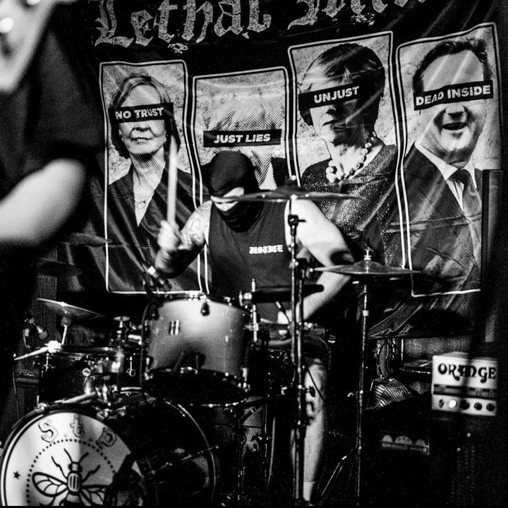
@timduffieldphoto
@timduffieldphoto

@fayel_photography