No Bonez - Identity
The Problem: Rebrand vegan food enterprise No Bonez. Their brand story has been one of struggle and survival up to this point, and while their original visual identity fit with this narrative and their street food vendor beginnings, they felt it important for their brand to visually evolve along with their progressing business model. No Bonez required a rebrand to help visually establish themselves as a more slick, professional and ambitious vegan food enterprise.
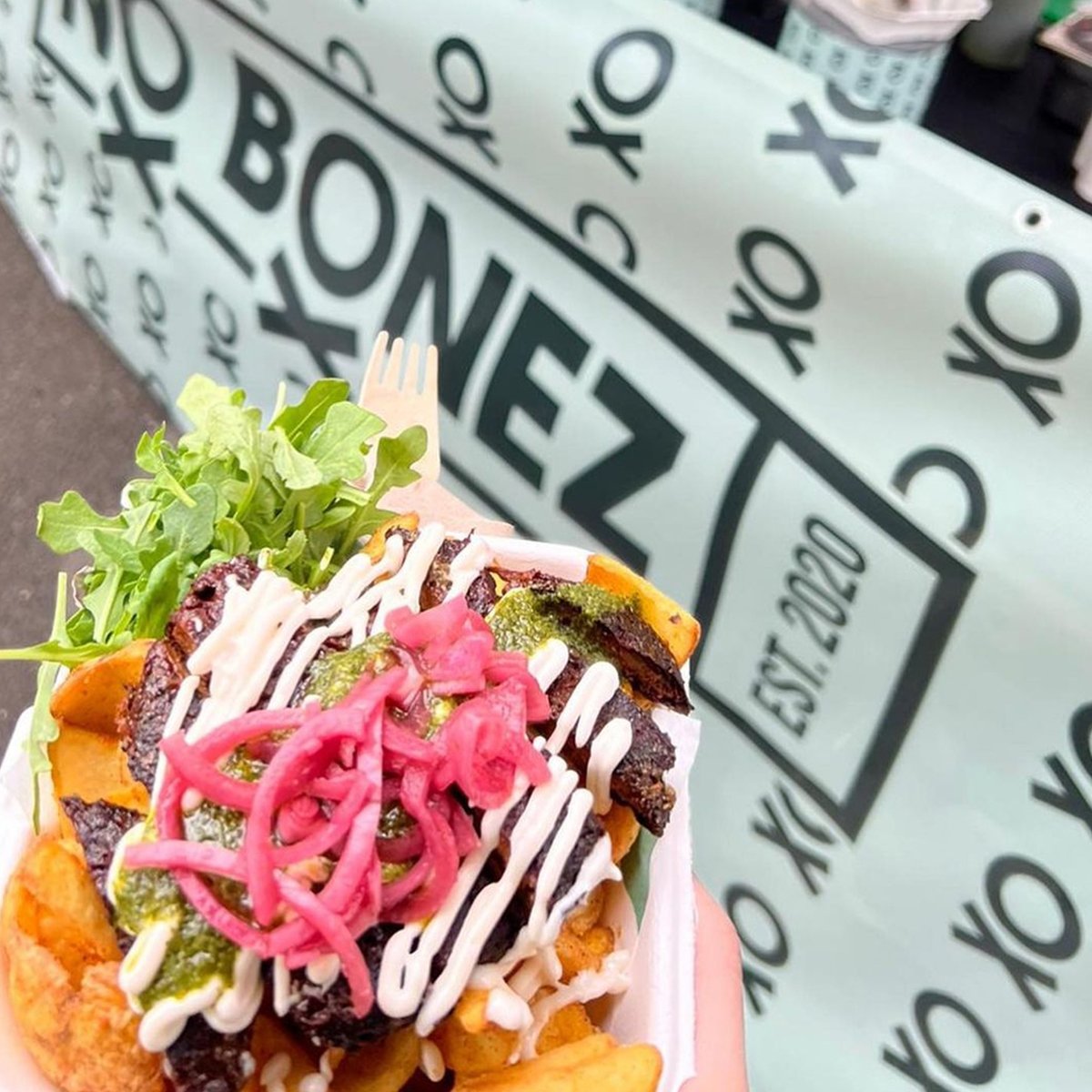
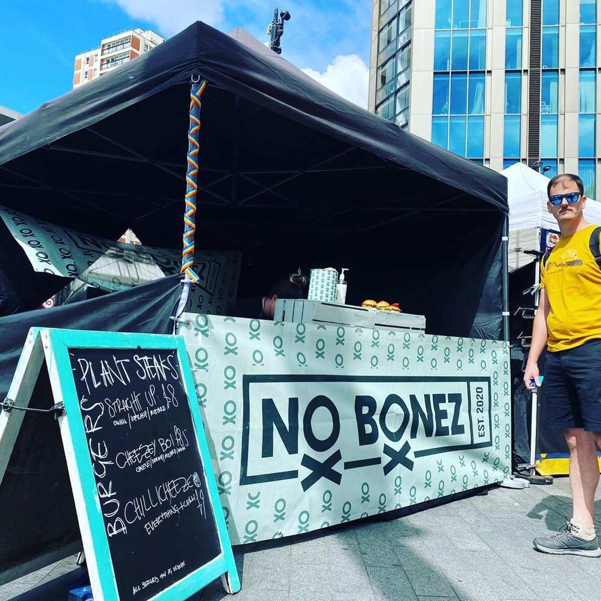
The Solution: To be able to adapt the identity to work in any situation that a modern food business encounters, we ended up developing a whole suite of logos and icons to form the No Bonez identity. All the logotypes and logomarks aim to communicate the brand’s stance on meat-free food and catering; an attitude that is strong, in-your-face, bold and proud. The aim is to communicate these ideals while remaining modern, sleek and professional in it’s aesthetic. The repeating ‘O/X’ icon is an abstract depiction of a skull & crossbones, a customised flag to wave at food events. The minimal and abstract depiction of which enables No Bonez to flip the traditional meaning of a skull & crossbones on it’s head, used here instead to indicate that there is no meat, dairy or bones involved in No Bonez food production. Bold sans-serif typography gives room for the iconography to work, while reinforcing messages of a modern, slick professional brand.
The primary logotype has No Bonez in it’s boxed formation, with the additional ‘Est.2020’ attached to the side. ‘Est. 2020’ is used as a reference to traditional butchers and green-grocers, who were often family owned and had built a successful business and reputation over generations. It is also an acknowledgement to the fact that the business was started during the Covid-19 pandemic, such an uncertain time for a business to be founded, never-mind become successful. Finally, ‘Est. 2020’ is used to visually establish some heritage with the branding, something that will be further cultivated over time as the business progresses.
The dark green and light green colour combo, while a relatively obvious choice for a vegan food business, is bright and bold enough to make No Bonez stand out from the crowd. This has successfully been put as No Bonez have developed a name for themselves within London’s super busy and fast paced food market circuit


“You have encapsulated exactly who and what we are as a 100% plant-based company which we are aaaaabsolutely blown away by. A huge thank you to Secret Industries, you have done a phenomenal job and we couldn’t be happier”