Something’s Brewing Identity - Preston’s 12 Year Cultural Strategy
The Problem: Create the identity for Something’s Brewing, Preston’s 12 year cultural strategy. This strategy aims to bring together artists and communities from across the region in order to develop an arts & culture hub for the whole of Lancashire, with Preston being the centre/focus of such a hub. The strategy has four main priorities; sustainability, connectivity, wellbeing, ambition. The identity must represent Preston and Lancashire, without explicitly containing any defining local characteristics or visuals. The identity must be modern, but not adhere to any current trends so that it can still be relevant in 2032, the year Preston’s next Guild celebration
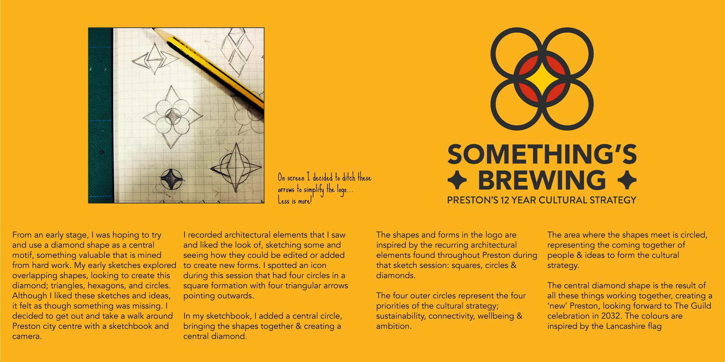
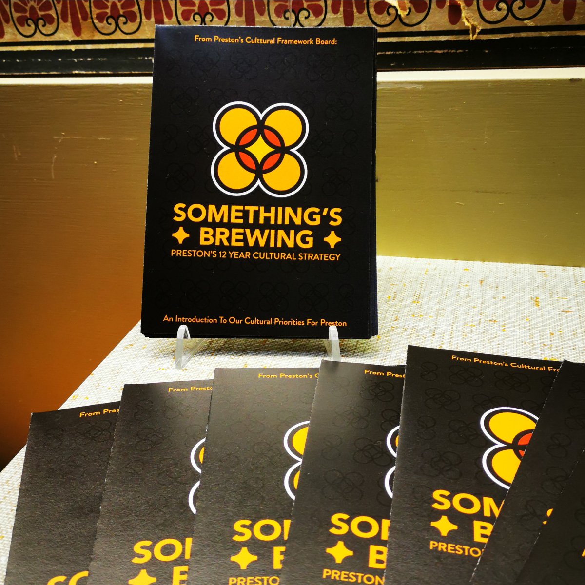
The Solution: Along with other local designers/artists I pitched for this project in January 2020, and I was selected by the committee because of the initial ideas I put forward. This idea was to create a logo out of interlocking and overlapping shapes to help communicate the idea of people coming and working together to produce something new, precious and positive. After several initial rounds and versions of the identity something still wasn’t quite right; the idea was sound, but the logos at this stage still felt like they were lacking. I went for a walk around Preston city centre, shooting reference photos to see if they could help with my ideas. I was drawn to architectural elements of the city centre, noticing recurring shapes; particularly circles, squares & diamonds. This session led me to developing what became the final logo
The logo developed was four circles held together by a fifth circle at the logo centre. The four outer circles represent the four main priorities of the Cultural Strategy; Sustainability, Connectivity, Wellbeing & Ambition. Where they meet, they form a new shape, signifying the strategy itself. At the centre, the diamond represents a 'new' Preston, formed from all the work and coming together of the strategy priorities and the community.
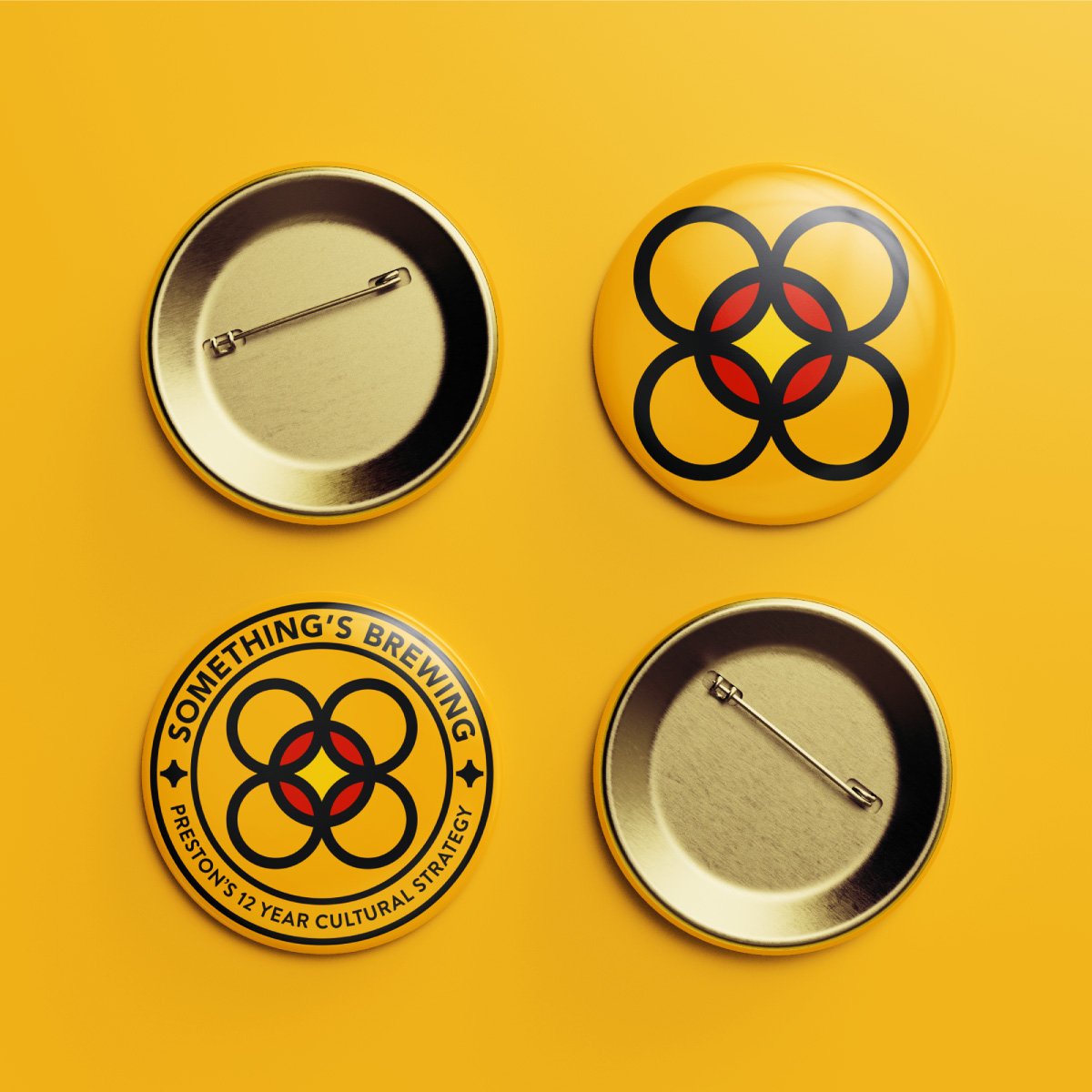
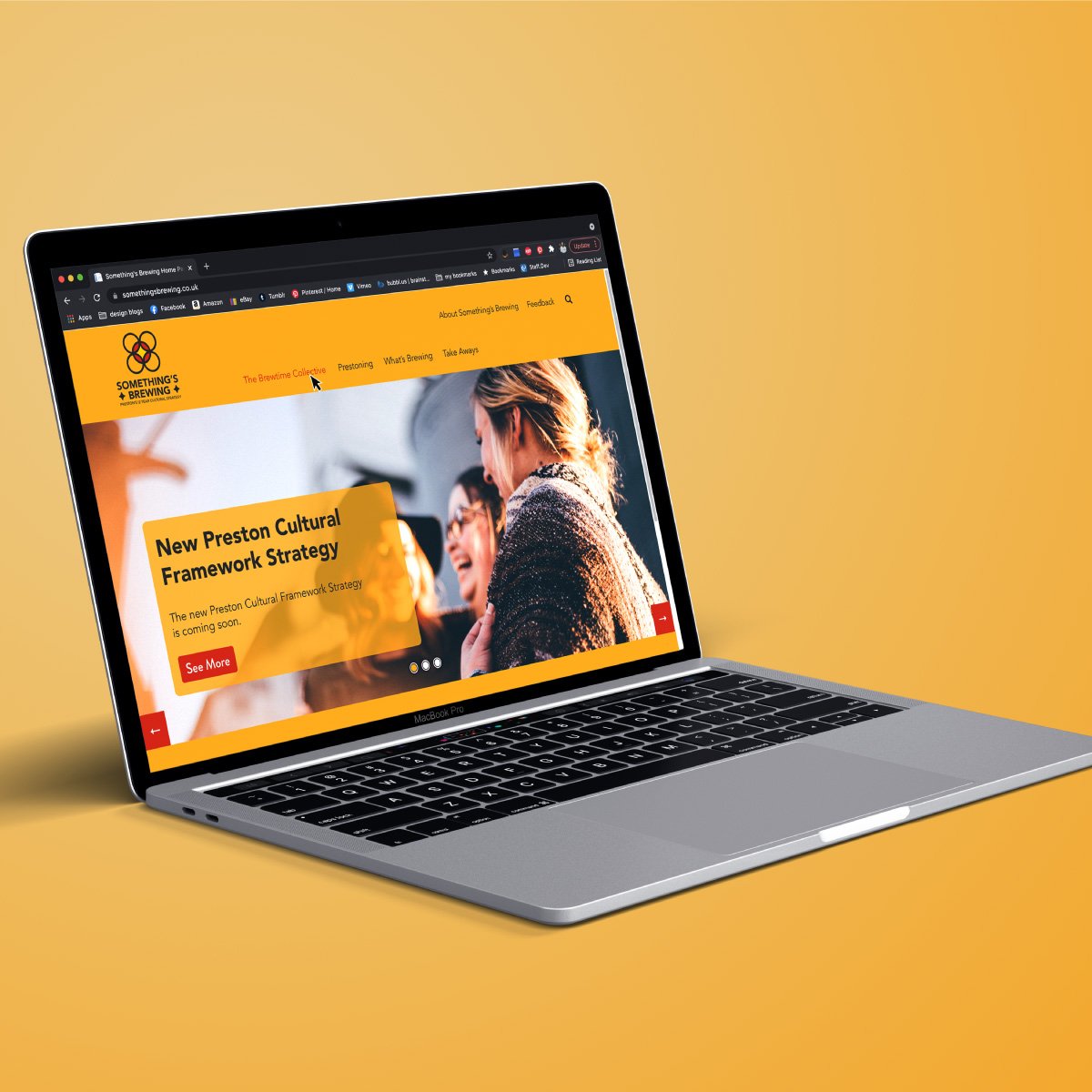
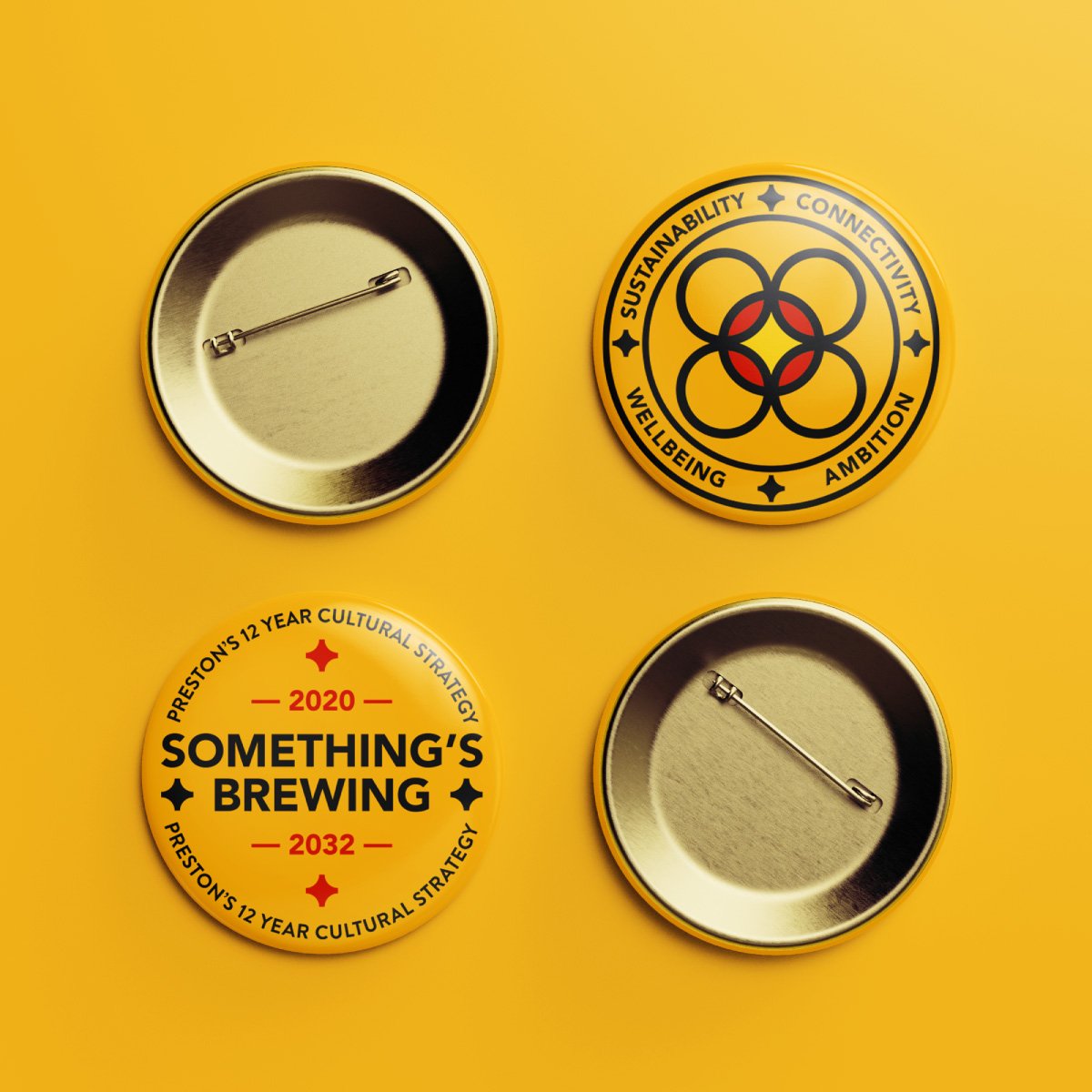
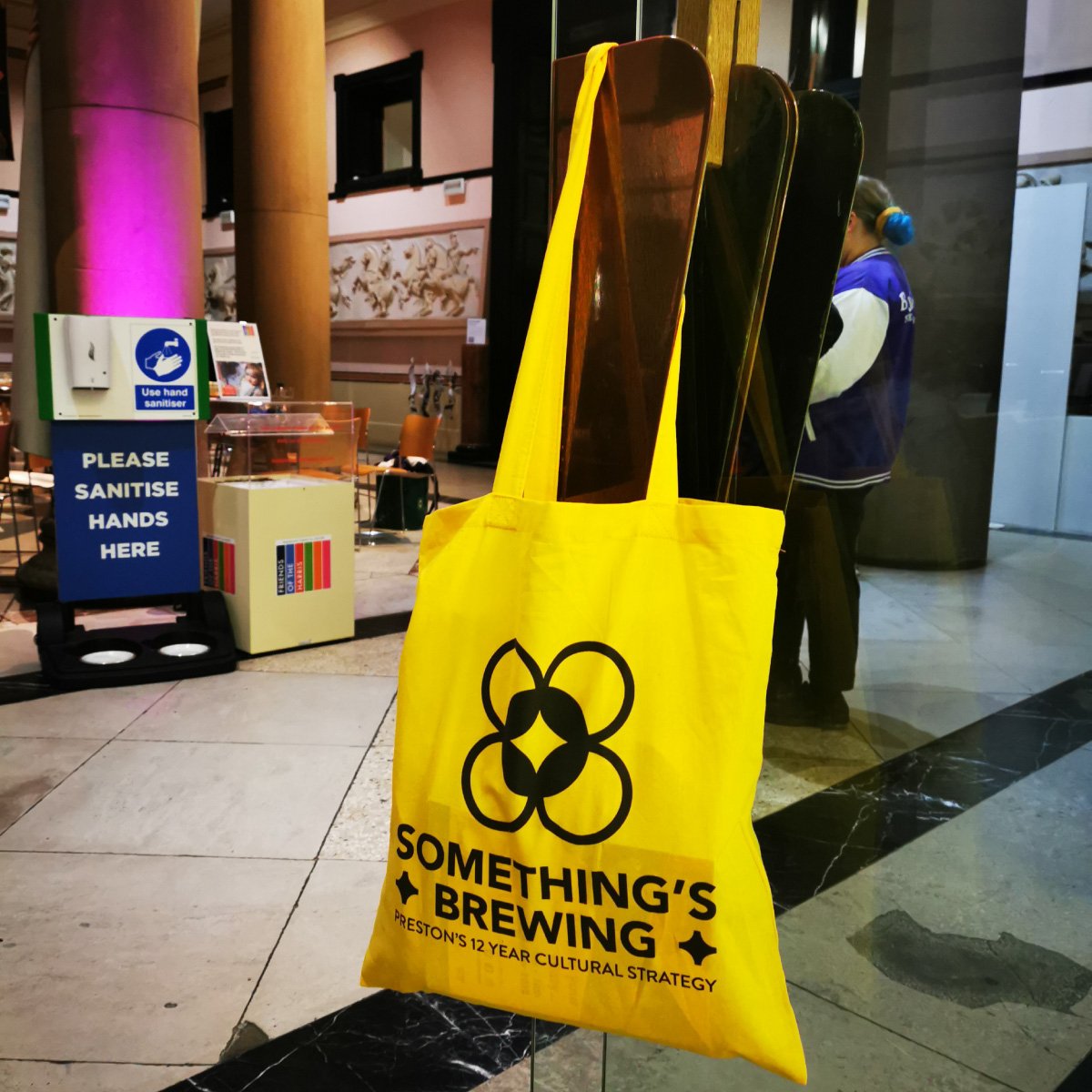
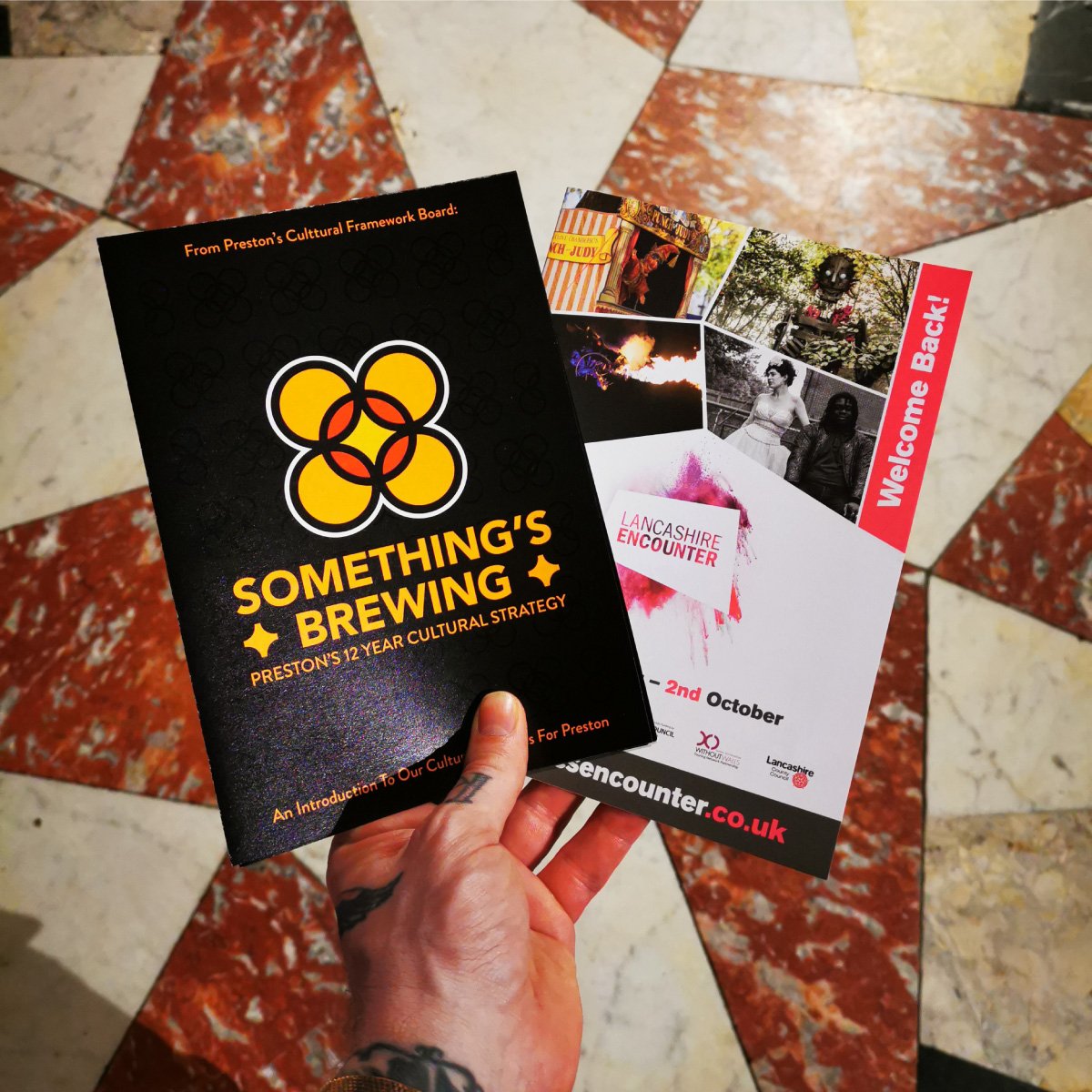
For the public launch of the identity and strategy, I also worked on collateral design elements. There were two versions of the cultural strategy document developed, a short form version and a long form version. The short form was developed as a double sided A3 piece that folded down to A5. The quartered document giving space to discuss each of the four areas of the strategy. The long form document was designed as a multi-page document, that went into more depth about the strategy aims and was to be used to attract engagement and funding from interested parties. I also proposed a website design overhaul that complimented the identity and strategy, and for the launch event I produced a welcome pack for attendees; a tote bag, badges and printed versions of the A3-A5 strategy document. The identity and strategy was launched at the opening ceremony for Lancashire Encounter Festival 2021