Blackburn College - 2021 End Of Year Show
The Problem: Develop artwork to announce, promote and present the annual end of year art & design show of student work at Blackburn College 2021. The exhibition is the culmination of all the art department’s work for the year. It is the final part of many student’s qualification both in further and higher education, and it is often the first time many students exhibit their work publicly. The work displayed is always of an extremely high calibre.
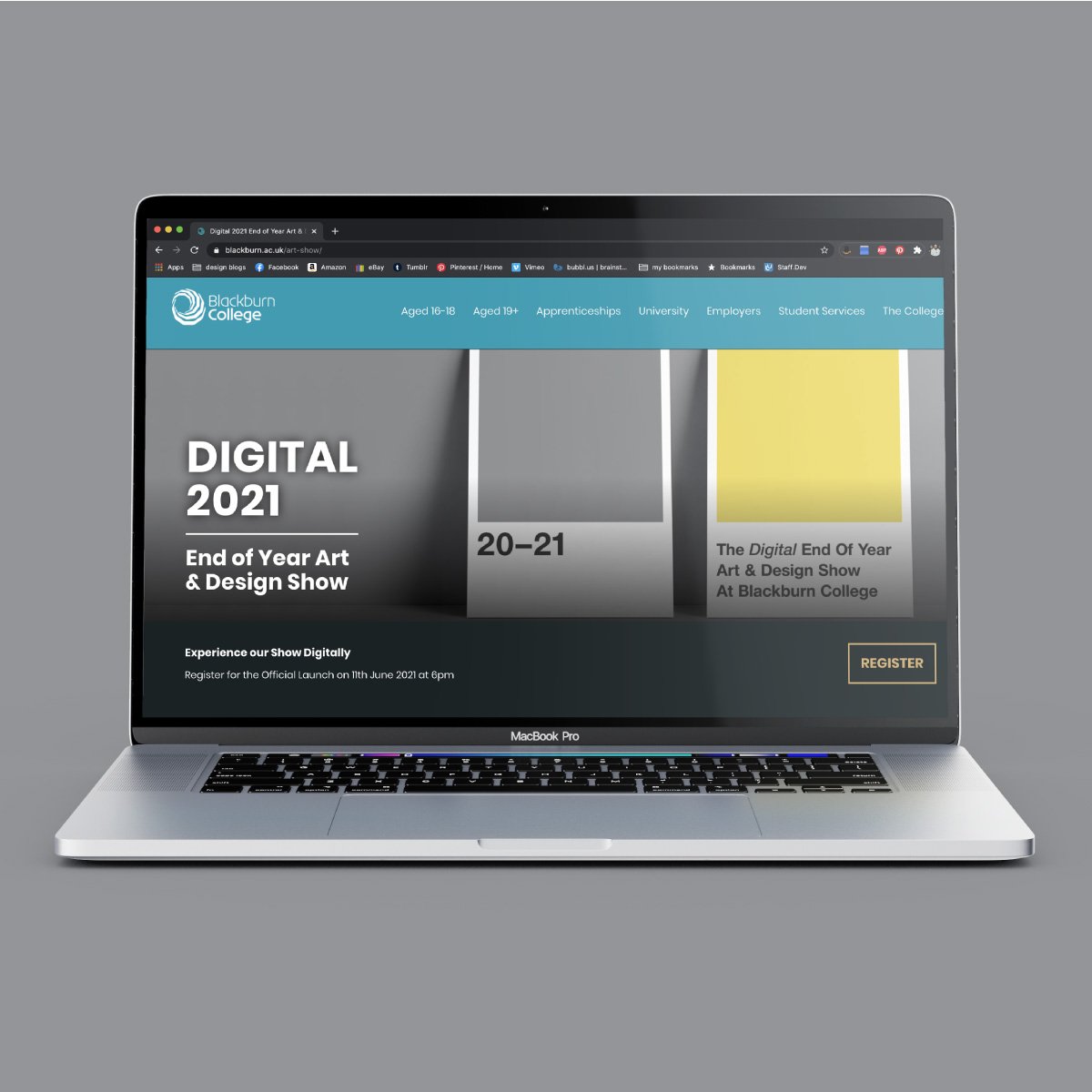
Still dealing with the aftermath of the pandemic, the decision was made for the 2021 show to be exhibited digitally, all work would be hosted in an online, interactive art gallery. However the choice was made to still place as much emphasis on it’s promotion as if it were a ‘regular’ end of year show.
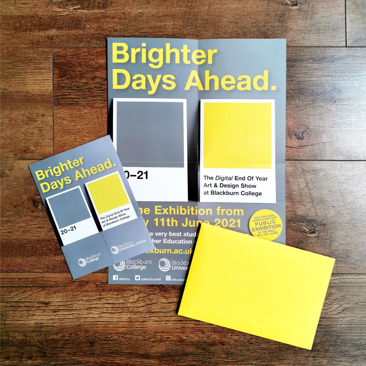
The Solution: The pandemic was still very fresh in everyone’s mind and had been particularly hard for the education sector as a whole, but even more so for art courses. Delivering extremely practical subjects with no face-to-face contact had been very tough. I chose to try and acknowledge this with the artwork for the show without dwelling on it in a negative way. We chose to hijack the Pantone 'Colours Of The Year' for 2021, which were a grey and a yellow. We used the grey to acknowledge all the difficulties and challenges we had all faced, and a yellow to offer us hope, optimism and energy as we looked forward to what was coming next: an analogy that was also fitting for the graduating Art & Design students.
Pantone colours being in and of the world of art and design also felt visually appropriate. For the identity and main promotion I simply used two traditional Pantone colour chip cards, but instead of the name & number of the colour, we replaced it with typography identifying the show. The background utilised the grey colour, symbolising the setting and backdrop for the creation of the work (the pandemic). The main title of ‘Brighter Days Ahead’ utilised the yellow, symbolising the artwork itself as a positive outcome from tough times. The yellow also symbolised hope for what came next for the students; new courses, new universities, new cities, new beginnings
For the printed invites to promote the exhibition I designed a gatefold format, to accentuate the two different colours for the show, as well as acknowledging the two levels of student work on display; further education students (16-19 yr olds) and higher education students (university). The invites opened from the centre to show all the exhibition details in the interior pages, and were sent out in bright yellow envelopes to grab attention. The Pantone themed artwork was also extended into print and online advertising, and was used to identify the student work in the online exhibition.